Feedback from my exhibition of Classic Stories at The Hub, St Marys in Lichfield has been very encouraging. The gallery officer said in an email that they had received an ‘amazing response’ from visitors. On my research visits, I have been pleased with the numbers; it has been a very busy week for the Hub, partly because it coincides with school half term, but also because they have opened a new coffee bar on the same floor as the gallery, and there have been several arts performance and musical events in the Hub this week.
My exhibition has benefited from the peripheral activities and programme of events. A steady flow of visitors have spent time viewing my collection, and that is very satisfying.
Conversations with visitors have been positive, with several discussions about the texts and my representation of them, along with comments regarding the right hand panels, particularly those with handwritten marginalia, or student notes. In this respect, I have acted as a participant observer to gauge responses to the collection, and have not identified myself as the author. I chose this strategy in preference to a previous idea in which I considered inviting responses in written form via a ‘comments box’.
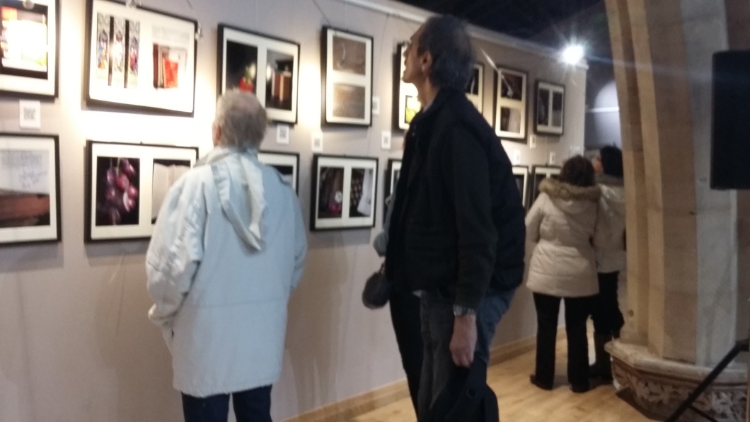
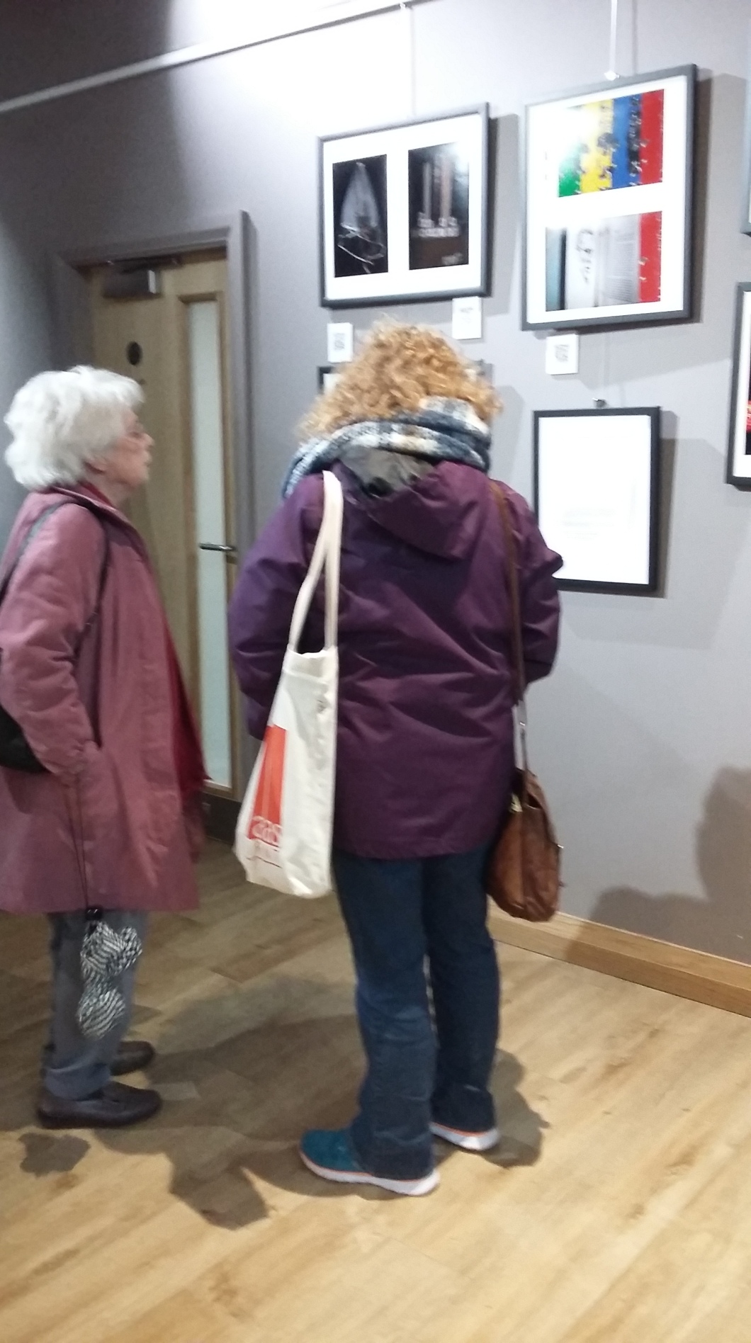
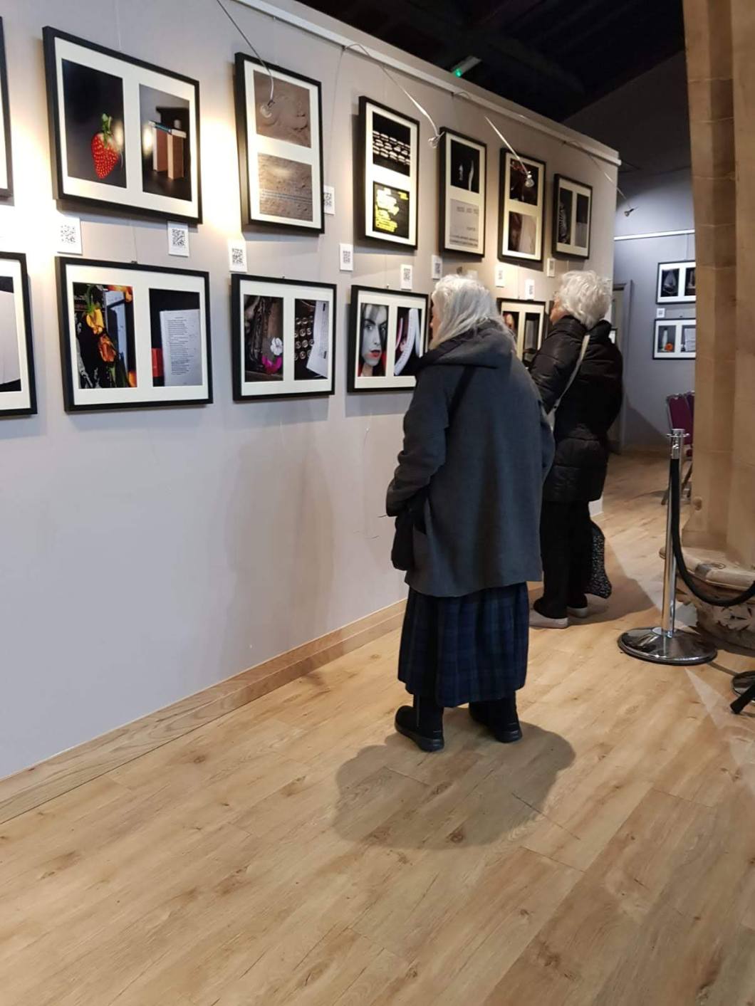
The photographs above reflect the discreet and unobtrusive participant observer style; they are taken with a low standard mobile phone camera, and though they are poor quality images, they provide documentary information of the profile of visitors: middle aged or above, caucasian. This is, in itself, representative of the small city of Lichfield, and also the likely audience for a collection of images inspired by classic English literature; it is a conservative (small ‘c’) dominion, geographically and intellectually.
+++++++++++++++++++++++
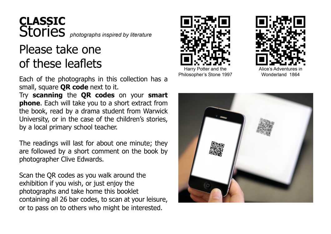
The gallery officers gave me some very helpful feedback regarding the multimedia (audio) component. Given the age profile of the visitors, and the likely audience, familiarity with QR code scanning on smartphones is not assured. There is a notice (framed in A4) giving advice on how to scan, but it is not adequate.
Whereas most visitors are happy to spend time studying some of the images and discussing them with their partners, friends as they circumambulate the gallery, they are less likely to take out their phones and scan the QR codes. This is a pity, as the readings from the university drama students add something to the experience. I might say also, with absence of modesty, that my contextual analysis that concludes each reading might be thought-provoking or informative.
The gallery officers have suggested that, for my second exhibition,( in April in Cirencester) I produce a leaflet which contains all of the QR codes, with specific instructions on how to access the readings via the codes. Interested viewers will be able to scan on site, or take the leaflets home and scan at their leisure or hand them on to others. The QR codes take the scanner to a Youtube audio recording which also includes the diptych image.
There are 26 QR codes in all, so the leaflet will be three pages in all (stapled together) on A4 paper, the front page of which is below. My next recce visit to the gallery in Cirencester will involve a discussion with the gallery staff with a view to providing this booklet/leaflet facility.
+++++++++++++++++
Another piece of advice offered by the staff is to have two of the images enlarged and framed, to create an impact. The 26 images in the collection are all diptychs on 20″ x 16″ frames, each individual image being 12″ x 8 “.
The gallery staff suggested enlarging two striking images to 24″ x 16”, framed singly. I feel that they have a point, and have decided to send via Loxley Colour, for two enlargements, one of the Scarlet letter, and another of one that I have produced htis week, during the course of the exhibition – Wuthering Heights.
Both of them demonstrate a shift in my own practice, in so far as I am combining still-life with portrait photography via layering.
They are below:
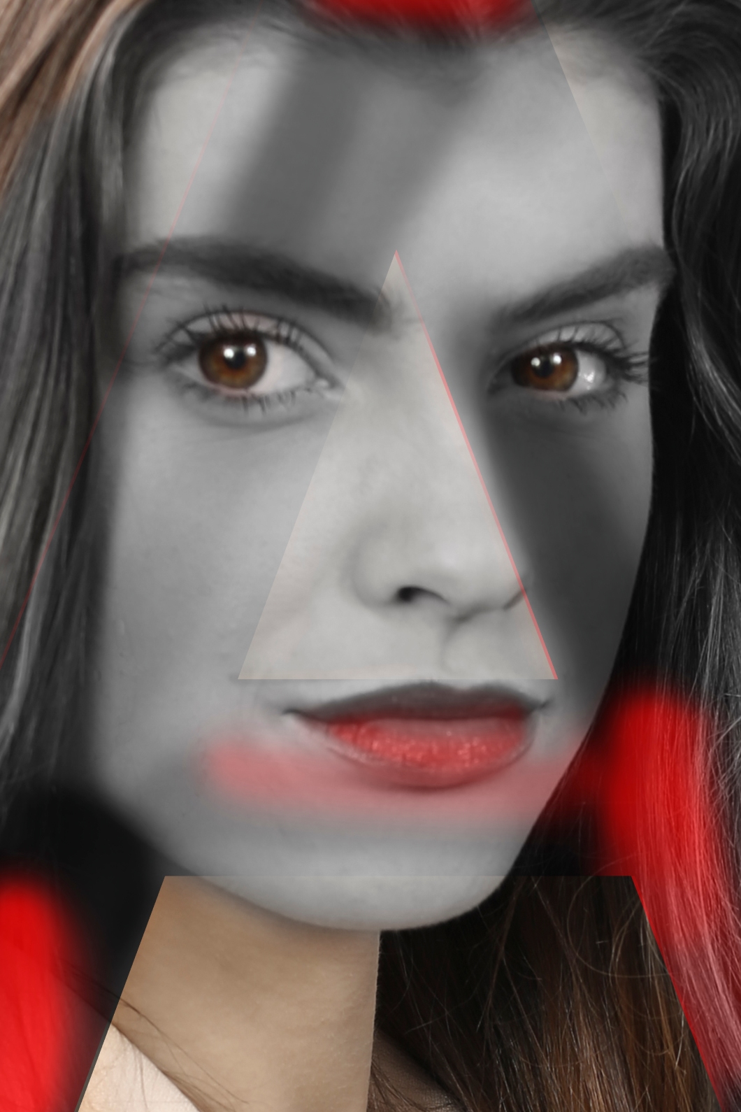
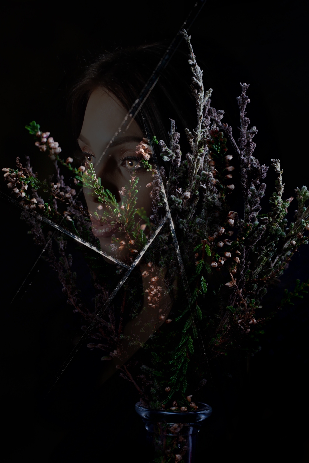
In both cases, I am aware of two possible criticisms. The first is that I am, for the purposes of attracting an audience, succumbing to the temptation of using images that have a commercial aesthetic; they might also be labelled as images that attract the male gaze (Mulvey) with the ‘masculinization of the specator position’. In both cases, I have been careful to choose an image that best reflects, or represents the character in each novel – the first is Esther Hope, in Harwthorne’s 1850 text The Scarlet letter. The second is Cathering, in Emily Bronte’s text Wuthering heights. My previous attempts to represent Wuthering heights had been failures in so far as they lacked impact. This version, I feel, conveys more effectively the power of the story, its mixture of romance, raw emotion, its portrayal of conflict between the wealthy and the working class, and the sense of the supernatural that permeates the opening and closing chapters.
The central character in The Scarlet letter is, like Catherine in Wuthering Heights, a powerful personality. Esther is much maligned, much wronged, a young woman of immense dignity in the face of fierce backbiting. She withstands vitriol – it is a story that could resonate with our nasty, social-media age. The expression of the subject in this image, I feel, conveys strength, dignity and steadfastness.
+++++++++++++++++++++
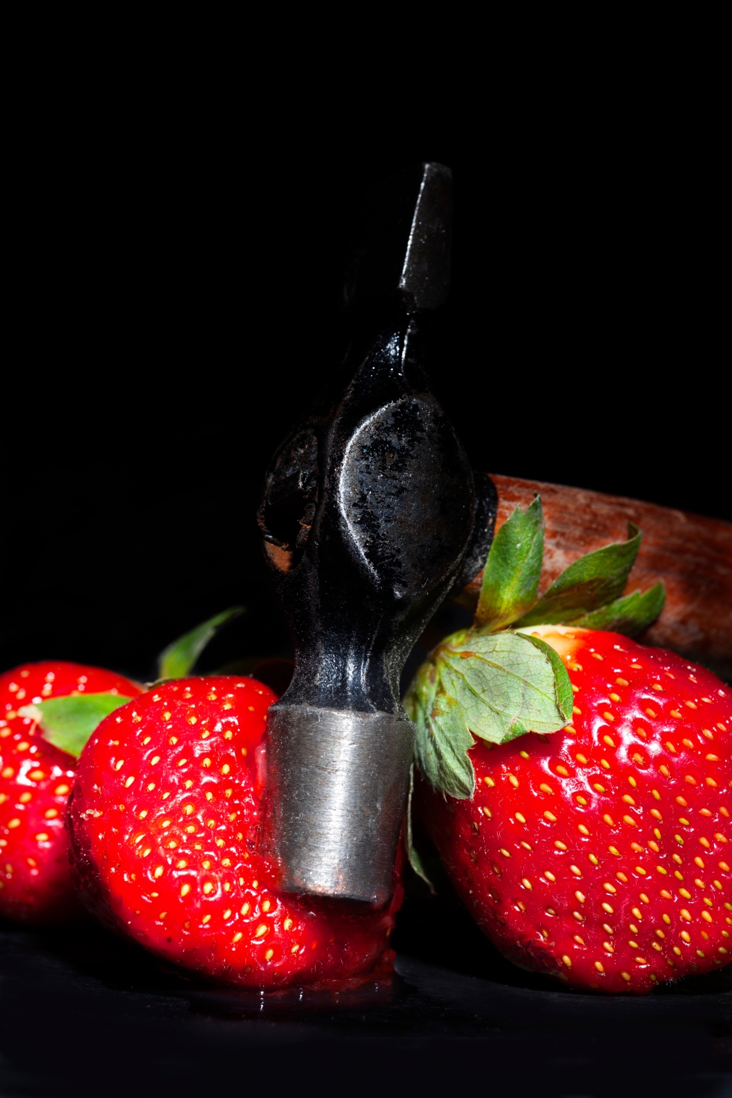
Many of the visitors commented on the Jane Austen images. The Pride and Prejudice diptych sparked discussion for vistors,a s did the representation of Emma. I note with some satisfaction that the week of my exhibition coincided with the first week of cinema showings of the film ‘Emma.’based on Austen’s book. My satisfaction comes from the fact that the director chose, as one of her promotional stills, an image of Emma biting into a strawberry. My image uses a hammer smashing into a strawberry. It is the use of the strawberry as symbolic of the story that is relevant here. The teeth, or the hammer, penetrating the soft fruit could be seen as a symbol of displaced violence – the stinging criticism of Miss Bates delivered at the strawberry picking outing is the closest Austen gets to violence in this, or any of her novels. It could also be seen as seductive. Certainly, in the film still, there is an ambivalence about the image.
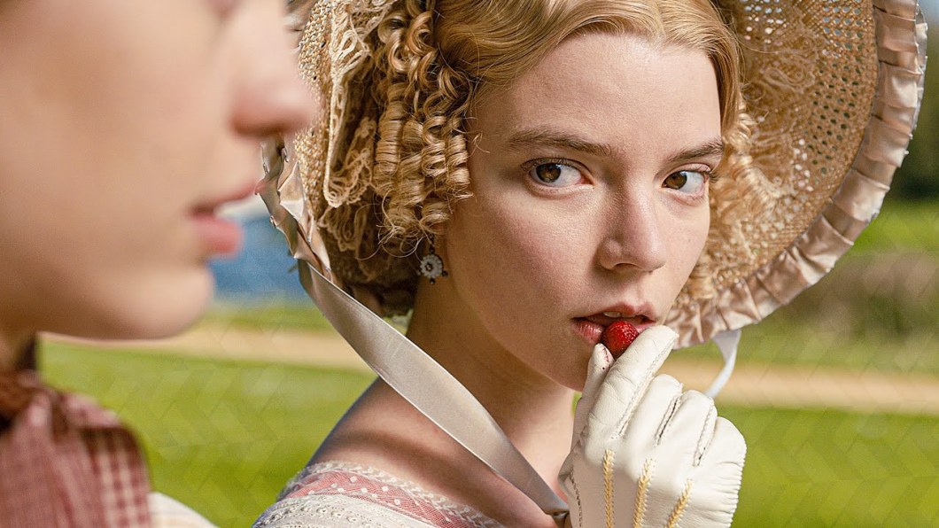
Much is being made of the fact that the director of Emma is a photographer. Autumn de Wilde is known for her music and fashion photography. The photography, the cinematography, set pieces, costume and style of the film tend to suggest a director well-versed in the power of the still image.
+++++++++++++++++++++++++
Emma. dir. Autumn de Wilde 2020 distributed by by Focus Features
Mulvey, L Afterthoughts on Visual Pleasures and Narrative Cinema published in Framework 1981
